We Shoot Photography Of The Day For 7/29/2015
Wednesday, July 29th, 2015
Click on image to enlarge.
Click on back button to return to post.
Click the “Home” tab above to see earlier posts.
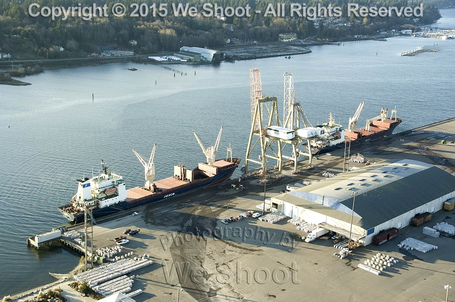
Aerial view of the Port of Olympia, Washington by Seattle commercial Photographer We Shoot.