Weshoot.com

The Official We Shoot Blog

  • Home
  • About
  • To Comment

Archive for June, 2010

Reflecting on Reflections, Part 3

Monday, June 28th, 2010

“The Shoot From Hell,” said one of my assistants, in reference to shooting the electronic control panel housed in brushed stainless steel.  Brushed stainless is no shiny brass doorknob to shoot, see previous blog post “Reflecting on Reflections, Part 2,” but it is definitely something difficult.  The unit (see images below) is a rather large, oblong-shaped, heavy electronic control panel with three red LED read-out screens which were as reflective as a mirror, housed inside of a brushed stainless steel shell, which was also quite reflective.

The brushed stainless, unlike the doorknob, won’t show my countenance, but will show all lights, colors, and dark areas surrounding it.  Any light that is not broad, whether a room light, a window, or the reflected light off our clothing, shows up as a blurry, colored reflection blob.  The size of the unit makes it difficult to isolate easily.  Many different exposures were made to control where lights sat, where reflectors were aimed, and where the assistants and I were situated.

Each setup or position of the unit was accompanied by moving lights and camera and adjusting everything many times.  My assistant who muttered the “From Hell” phrase, is himself a good photographer who eschews lighting and strobes to create images.  He mostly likes to shoot with available light.  He said it would drive him crazy trying to photograph things like this for a living.  I, on the other hand, view it as a challenge.

Finally, when I finished shooting the product, many hours were spent retouching and enhancing the images.  I then submitted the images to my client as low-res jpegs over the ‘net, and we worked together choosing the background for the images he liked.  See the images below.

While reflective objects present a challenge, make sure your attitude toward them is not defeatist.  This is difficult shooting to say the least.  Hard work and determination is the hallmark of anyone trying to get this done.

One last word on this kind of shoot.  It does not lend itself to using a point-and-shoot camera with the flash on the camera.  For the most part, it has certain minimum requirements of a good DSLR camera, and sufficient off-camera lighting and lighting equipment.  Otherwise, the results will be unsatisfactory and amateurish.

– Gary Silverstein

click on image to enlarge

click on image to enlarge

click on image to enlarge

Tags: enhance, Photoshop, reflecting, reflections, retouch, shoot, shooting
Posted in Learning | Comments Off on Reflecting on Reflections, Part 3

One Cool Picture

Saturday, June 26th, 2010

As I sit here, an old friend comes to mind.  A camera repairman in Los Angeles.  Whenever I had any trouble with a camera, I’d go to Marvin.  He may have been around fixing cameras for Ansel Adams back in the day, as far as I know.  He knew everything – and I mean everything – about cameras and their operation.  I often think of how great he was at his job in his off-the-beaten-path repair shop, and how so many people weren’t aware of his business, and didn’ t know of his talent.

I knew another talented professional – an auto repairman – who got lost in the shuffle because of his far-out location.  His customers relied upon him every time they needed a repair.  On occasion, they’d mention him to a friend, but in this busy world many of us neglect to talk of such things to others and, like so many professionals, this repairman had days when no business came in, as was the case with my camera repairman.

One day, I got a call from the auto repairman requesting I take a photograph of him to accompany a newspaper ad about his business.  I suggested an image of him working over a car engine, and even though many newspaper ads don’t work, this one did.  People shuffle through their paper and flip through their magazines.  They barely take notice of their trade periodicals, oftentimes not even noticing the articles, let alone the ads.  Why did this one work?  I’d like to think it was because of this picture, and maybe it was.  New customers responding to the ad would mention it when they called for an appointment or when they came in to see him.  “What a cool picture!”  And as they got to know him, they’d say, “watching you work on my car reminds me of that newspaper photograph.”  Apparently the image seemed to say to them, “I care about what I’m doing.  I care about doing a good job.”

In the case of this wonderful automotive technician, they were right.  This mechanic cared, just like my camera mechanic cared.  Did the photo say that to the people who responded to the ad?  Apparently so.  Looking at it from that viewpoint, it’s not necessarily advertising that brings in the work, but the kind of advertising.  In this case, advertising with photography.  (An interesting anecdote:  no customer seemed to recall that the photograph was accompanied by an ad, even though it obviously was since it brought the new customer to his business, but the picture was what stood out.)

What made the image work?  Was it the sparkle in his eye – made even more luminous by our professional strobes?  Was it the highlight on his wrench – made even more powerful with my assistant’s precise positioning of the mechanic’s hand?  Whatever it was, without the picture, the ad in this case may not have even been noticed.

There are many professionals like these two mechanics.  Do you know of some?  If so, reach out to them.  Tell everyone about them.  Hey, even better.  Take his or her picture.  A good one . . . shot with care.

 – Dione Benson

Tags: ad, advertisement, advertising with photography, ansel adams, auto mechanic, auto repair, camera, photograph, picture, referrals, repair, strobes, technician
Posted in Marketing | Comments Off on One Cool Picture

Reflecting on Reflections, Part 2

Thursday, June 24th, 2010

Without a doubt, the hardest single thing I ever photographed was, of all things, something so ubiquitous that we handle them every day.  I am talking about door knobs.  Plain, highly reflective, brass doorknobs.  Now, why is it so hard to photograph a doorknob?  Well, it becomes a lot more difficult when there are some rules.  Rules like one would run into with a doorknob manufacturer looking for someone to shoot images of their products for promotions.  Do you think they want a reflected image of a happy, smiling distorted photographer looking out from their new brochure at the viewer?  How about seeing that photographer’s camera and tripod, or the space the doorknob happens to be in?  Simple, inexpensive, plain, highly polished brass doorknobs become painful to contemplate as a product photographer.  They not only are spherical and reflect the entire world around them, they have a backing plate made of the same stuff, that will reflect things that exist behind the knob, from the reflection on the back of the knob.  

Several years ago, we had spoken with a potential client, the marketing department head at a large manufacturer of doorknobs, hardware, and faucets about working for her company.  She said she had several photographers she used for shooting these products, but she said she would send us a sample of their products so that we could submit a test photograph to show that we could handle this type of photography, in case she needed our services.  Parameters for shooting this product were clear.  Shoot it on a 4″X 5″ transparency, and no retouching of any kind was permitted.  She said they did any retouching needed at the graphics department at the manufacturer.  

About 5 days later, the product arrived by UPS.  There was a plain brown cardboard box inside the outer package.  I opened it up and beheld a photographic nightmare.  It was an inexpensive, highly-polished brass doorknob set, complete with keys.  

It reflected everything!  It saw me, the room, everything in the room, and to my horror, the backing plate re-reflected everything the back of the knob “saw.”  I knew this was to be a fight.  I looked at images of doorknobs in advertising.  They looked perfect.  Some were “brushed” metal – not polished, but still shiny.  Some were dull finished, and just reflected highlights.  The polished ones stood out.  No reflections of photographers, cameras, tripods, rooms, etc.  I assumed that there was some reflection of a camera lens somewhere during the taking of the image, as there was no way to avoid the reflection from the angle presented.  A different angle may have allowed one to position the lens where the reflection would be positioned over the keyhole, but you can’t shoot there for different angles.  The first problem includes camera, tripod and photographer reflections.  One way to avoid this taking up a lot of room on the doorknob is to make a blind out of white material, like foam core, and cut a hole through which the camera lens “sees” the doorknob.  

Although this cuts down on untoward reflections, it still reflects the lens and the hole, unless the hole is dark and tight around the lens.  I figured this made for a minimum of retouching at the graphics department, and would be acceptable.  A second consideration was the lighting.  Lights or hot spots show up on the product itself and a smooth highlight with no hot spots would be a better solution.  Everything I tried did not work!  As said before, putting a piece of foam core in front of the doorknob cut down reflections, but I thought that aiming lights from behind the doorknob and bouncing the light toward the white foam core blind would produce the effect without bad reflections.  I was wrong.  The strobe “soft boxes” reflected into the back side of the door knob and re-reflected off the backing plate.  I had distorted oblong light reflections staring at me from the backing plate.  

It became evident there must be a way to do this.  I tried white sheets, but the lights created hot spots, and it reflected any corners and folds.  I had seen a shooting tent at my local pro camera store, and headed down there next.  A tent like this was used to evenly light small products and I thought this was the ticket.  It cost $250.00 plus tax.  I got the tent home, and assembled it.  It was made of a translucent white fabric, meant to diffuse the light inside.  It also was rigid and had seams and a rigid frame inside the fabric which showed up in the reflections.  It had several holes for camera placement, and try as I might with stuff to cover them, they showed up, too.  Fortunately, I was able to return the tent for a refund as it really didn’t do the job.  

I even talked to man who owned a company that made plastic blister packs in Santa Barbara.  I drove out to Santa Barbara to get a prototype dome of a transparent, but clouded plastic that he was thinking of producing.  It took out most of the distracting reflections, but reflected the cloudy nature of the dome and made the doorknob appear dull and not highly reflective.  I sent it back to Santa Barbara with a thank you note and a description of the effect.  

I finally built a box enclosure of translucent white plastic, got what I thought was a good image and sent that to the marketing manager.  She said to keep the doorknob, and she would call us if she needed us.  Last I heard, she was working for another company doing something completely different.  She never called!   

Below is the image I created, after scanning it and retouching it for our portfolio.  Shiny, reflective doorknobs are tough.  Try it if you doubt me.  

– Gary Silverstein      

Doorknob with minimal reflections - click on image to enlarge

Tags: 4x5, camera, photography, Photoshop, reflecting, reflections, retouch, shoot, shooting, view, view camera
Posted in Learning | 10 Comments »

Website Photography – Shoes of the Trade

Monday, June 21st, 2010

In regard to business marketing, I hear a lot lately about the importance of social networking via LinkedIn, Facebook, and Twitter.  These now accepted “Tools of the Trade” are geared to procure business and, if done right, are utilized to connect your prospective clientele to your website.  Your connections, “friends,” and fellow “tweeters” come to your website to read more about your business’s product and service.  That’s the idea, right?  So, now they’re there, and what do they see?  A great website with Flash, wonderful text, and “visuals.”  But one thing in too many cases is sorely missing.  Effective visuals.  Positively impactful, impressive, and just good old-fashioned aesthetically pleasing photographic visuals.

I hear this sad refrain from almost every website designer with whom I speak.  “My new client already has pictures, and no matter how much I say I want new photography, they say ‘these are good enough.’ “ And, yes, the vast majority of website designers I speak with say, “no, they aren’t good enough.”  “Not only,” they complain, “are they not good enough for their lack of professionalism, they are low in resolution, and, more often than not, they are a complete contrast to the professional, artistic, and beautiful website I want to create for them.”

So, what’s a professional, artistic web designer to do?  Less stellar work so as not to contrast with the horrible pictures?  More beating of their heads against the wall?  Resorting to other self-destructive activities

Tell you what, instead of contributing to the demise of artistry in web design, let’s give your web designer a break.  Just like website designers, I expect you want photographic images at your site that reflect the work you do in the most positive and attractive way possible.  After all, having a website is an essential tool of the marketplace.  It’s your online brochure.  And like your brochure, showing your product in its best light necessitates putting your best foot forward.

You know the importance of keeping your shoes polished in business, right?  A good haircut, attractive clothes, well-manicured hands?  I mean, you never know when you’ll encounter a potential client.  You never know when a potential client is looking at your website either.  Shine those shoes.  Polish those pictures.  Show your product off attractively.  Give everyone who goes to your website the impression that their opinion is valued.  Because it is.  If the impression created by your website is that your product lacks value, they won’t value your business, and since this is all about social networking, guess what impression will be emailed and tweeted to your “friends” and “connections” . . . and, directly or indirectly, to your prospective clientele? 

If through LinkedIn, Facebook, Twitter, or whatever means of social networking you employ you invite people to a website utilizing photography that is unpolished, unattractive, and unprofessional, your business, too, will be interpreted as unpolished, unattractive, and unprofessional.  Your website – just like your polished shoes – is one of the most important Tools of the Trade.  Make sure you put your best foot forward with a website with polish . . . photography that shines.

 – Dione Benson

Tags: art, facebook, linkedin, Marketing, photography, shoes, social networking, tools, twitter, website, website designers
Posted in Marketing | Comments Off on Website Photography – Shoes of the Trade

Reflecting on Reflections, Part 1

Saturday, June 19th, 2010

I was once asked about the hardest thing I ever photographed.  Of course there have been several difficult things to shoot, but as a commercial photographer, some product and catalog shoots and reflective objects just jump out.  Reflecting on a number I have done, I think they have gotten a bit easier for me with time, either because of experience, or the ability to use digital retouching and enhancement techniques, or both.  To say that there are no more challenges would be a misstatement, however.

My first bout with reflective product shots came during the era of film, long before digital capture or scanning was even possible.  Digital retouching was a pipe dream for the future.  I was asked to photograph jewelry with a large-format view camera (a 4X5) on transparencies.  We opted to use our then-considered-powerful 1200 watt-second Balcar studio strobe set for lighting.

The jewelry pieces were white metal (silver, I think) and included rings, earrings, and a necklace.  All pieces were to be shot in one image, laid out on a blue fabric.  I was to capture highlights from the reflecting white umbrellas mounted on the strobes in each piece of jewelry in the layout.

In those days, we were located just south of Hollywood, California, and there were many film labs nearby, so film processing turnover was fairly fast – three hours on a non-rush basis.  We had 4X5 Polaroid self- processing black and white positives that could be shot with the 4X5 camera that we could see as proofs prior to shooting the transparencies which needed processing at a lab.

The Polaroids were over a dollar each, in those days – a big, but necessary expense.  For this shoot, we went through something like ten of them, just trying to position the irregularly-shaped jewelry, so it would show certain highlights.  Each time we shot one, we would find one piece that would go dark, with no highlight.  It would have no sparkle, it would look, well . . .  black!  We finally got what looked like a good Polaroid, put in the transparency film holders and shot four transparencies of the same shot (one for us, one for the client, and two for insurance in case we needed to lighten or darken the exposure by chemical process).  We ran it to the lab up the road, and three hours later went over there to see our new transparencies.  One of the pieces of jewelry had moved slightly and it went dark.  There went a bunch of money, and a lot of time.  It took until the next day before we got it right.  It was a good experience, and I learned a lot.  I managed to find the image in our archives.  See it below.

– Gary Silverstein

Tags: 4x5, camera, film, jewelry, large format, layout, reflect, reflecting, reflections, shoot, shooting, view camera
Posted in Learning | Comments Off on Reflecting on Reflections, Part 1

Setting up a blog for your website

Friday, June 18th, 2010

Setting up a blog for your web site, in my humble opinion, is not for the faint of heart.  I have written blogs before, and I have used the free services of “Blogger” (Google) and “Windows Live” (Microsoft).  Setting up a blog on one’s website is a whole different kettle of fish.  First, the services just mentioned are meant to be on the blog provider’s sites and not on your own.  They are really quite easy to set up.  Decide to create one, and you can be an author in a very short time, maybe minutes.  Not so with putting a blog on your own site.

I read that putting a blog on our website increases our visibility on the web with the search engines, which helps SEO, or Search Engine Optimization.  Blogs not on our website also help by making links back to our website, but I would think not as much as a home-grown weblog could.  Blogs are text-rich, and the search engine crawl bots like that.

First, I searched the web for how-to-do-it pages.  Then I decided to check with my host provider, as they seem to be up on everything, and I found that you need something to make it work, called an SQL database.  I happened to know that my provider had such a weapon in their arsenal and were willing and able for me to use it.  I wrote them and they recommended WordPress as the program of choice.   They told me how to access this in my control panel for our website.

Let me be clear about this:  Don’t attempt this at home!  Unless you are comfortable with html and web stuff, this is best left to professionals.

I have written some websites on and off for many years, and felt that if someone who did not make a living creating websites could attempt this, it would be me.

I went into the control panel and downloaded the program (and blog) to the root directory of the website.  In the documentation one usually sees after an installation, it stated that I might want to put the program and blog in a separate subfolder, as the files can look pretty messy in the root folder.  I then attempted to do that in the configuration file, saved the changes, exited the program and was now unable to reenter.  I got that feeling that one gets after accidentally deleting something very important and can’t get it back.  I called tech support with my tale of woe.  The tech said he would advise me to uninstall the program (I hadn’t written anything at that point) and reinstall it in a new folder off the bat.

I reinstalled the program and proceeded to set it up.  One of the configurations was to be able to put in “pretty” URLs for when people wanted to bookmark a post.  This would make it easier for them to identify the post without having to rename it.  More on this later.

I opted to use one of the free templates to lay out our blog.  I chose one, and set up an install.  It wouldn’t install.  I called the tech at the ISP host.  He decided to do it for me.  It took him a while, but he finally got it.  If it stumped him (and he said he was familiar with WordPress), I probably would have gone crazy.  I thanked him profusely, hung up, and advanced to the next step.

I had worked with templates before, and wanted to rid the sidebar of this blog of unneeded links put in by the authors, as it would be confusing for you, the viewer, to figure out why you needed so much documentation on WordPress instead of photography.  Try as I might, I could make changes to the template, but when I closed it, it would heal itself and come back.  It was like the Hydra – every time you removed a link, I swear it grew back with more.  I realized that I had no way to save or update the file.  I then got back on the phone with the tech guy.  I was amazed.  I made 3 calls to that point, and I got a different local guy (US) each time.  I think he was a bit confused by my blathering on, but he was patient and had to put in permissions for me to make changes to everything in the sidebar.  One at a time.  Really.  In the end, I was on my way again.

This blog was starting to shape up.  I wanted to put in blurb somewhere telling what this blog was about.  I finally found the “about” page.  I went into the config screen and typed in my text and put our logo in it.  I clicked “preview.”  A Google page came up, saying the link was broken and it couldn’t find the about page.  I spent many hours trying to figure out why it wouldn’t work.  I knew the path didn’t look right for this file, but the only part of it I could change had the word “about” in it.  Dejected, I shut down my computer and called it quits to sleep on it.  I thought I had the idea early in the morning and ran to the computer to try it out.  I didn’t see that the page had an htm ending on the file name.  I was wrong. It still didn’t work.  And then it dawned on me.  The file name was all wrong.  Remember making “pretty URLs?”  I went back to the configuration page and unchecked “pretty” and rechecked the default.  Worked like a charm.  Now, hopefully, everything will work right and We Shoot has a real on-site blog.  It took 3 days, but it was worth it.

– Gary Silverstein

Tags: blog, blogging, business, weblog, website, write, writing
Posted in How To | Comments Off on Setting up a blog for your website

Getting the mountain to come out!

Thursday, June 17th, 2010

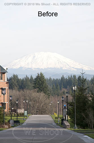
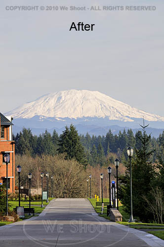
I work and live in the great Pacific Northwest.  The area from Seattle through Tacoma and Olympia, Washington to Portland, Oregon is generally where you will find me.  The features that stand out around here are views with a mountain in them.  Whether it is Mt. Rainier, Mt. Saint Helens, Mt. Adams, Mt. Baker, or another of those monoliths that dominate the scenery, sometimes they are far enough away to get aerial haze clouding the images.  Consequently, if the image is light enough for great detail in the foreground of the image, the mountain will appear so light as to almost disappear from the image.  Here are some ways to fix this: all involve the use of editing software of some kind, but the results can be worth it.  See the two samples below.


There are many ways to get this to come out in one image.  If you are using raw software, you can make two different tiff images from the same raw file.  Manipulate one tiff so that the foreground comes out with the proper density and color, and edit the other version to be much darker, with more contrast and saturation.  Name them differently so you can bring them both up in your editing software.  Copy the lighter image to the darker one as a layer.  You can use the following editing program operations to edit the image.

I prefer the following method over the one outlined above, mainly because it allows retouching of the image as one image, rather than dealing with layering two different unretouched images.  First, open your image in your editing program – the one I currently use is Adobe Photoshop CS4.  Next, retouch and enhance the image as necessary.  Next, make a duplicate layer.  Save the newly-layered file as a separate psd file.  Click the eyeball symbol next to the upper layer to make it invisible, and move to the lower layer to work on it.  There are several ways to darken the bottom layer.  I prefer using adjustment layers like curves, levels, saturation, etc., to get this done.  Once the mountain looks sufficiently dense enough to appear stronger in the image, I click on the eyeball spot again to again make the upper layer visible.  I then create a mask for the upper image.  I sometimes take the pen tool and trace out the mountain to select it by itself, making a path that will become a selection, but in any event, I use a black brush to paint out part of the upper layer and allow the lower layer to show through to some degree, or even 100%.  If I think it needs more tweaking, I sometimes make a “soft light” layer above all the rest of the layers and darken appropriate areas.  Once I am satisfied, I flatten the layers and resave it in a “retouched” folder with the same number.  As you can see by the images above, it makes the mountain stand out, and it looks better than what the camera recorded to begin with.

– Gary Silverstein

Tags: enhance, enhancement, haze, mountain, pacific northwest, retouch, view, Washington
Posted in Tips | Comments Off on Getting the mountain to come out!

Are your images noisy?

Wednesday, June 16th, 2010

Digital images have a problem not seen in film.  Digital images can have “noise.”  For a definition of noise, I will refer you to Wikipedia at: http://en.wikipedia.org/wiki/Image_noise .  Someone on the ‘net said that noise in digital images was like grain in film.   I don’t think so.  While grain in film was largely ISO or ASA dependent – lower grain at numerically lower ISO (ASA) numbers – noise seems to come from factors such as underexposure, quality of the sensor, how many megapixels are jammed onto the sensor, etc.  Grain happened all over the image, while noise seems to come up in areas of a digital image that are underexposed.  In my experience noise can take two forms: color and luminance.  Luminance is a somewhat grainy appearance and usually makes shadows appear to have dark mottled areas.  Color noise is grainy, mottled, and sometimes adds colors like yellow and green to the mix.  Even relatively good cameras at low ISO numbers can have some noise in the shadow areas, especially when trying to lighten them up.  Some of the ways to deal with noise are: get a low-noise camera; overexpose a little; shoot raw images, which have more latitude for correction than jpegs; use noiseware software; darken shadow areas so the noise is blended; blur the shadow noise so it is not mottled; color or clone in noisy areas.

Noiseware, such as that made by Imagenomic, or Noise Ninja, etc., use algorithms to alleviate noise.  But be warned, the heavier you use such software, the softer the image will look in the areas covered by the software.  In other words, if you use the software on the entire image, it may appear soft or blurred.  One can use editing software to section off areas of an image and only use the software on those areas.  I do it a different way.

I open the image in Photoshop and create a duplicate layer of the image.  I go to the bottom layer and use my noiseware plugin filter to smooth the noise on the entire layer.  I move up to the upper layer, and create a mask on that layer.  While in that mask, I simply use black to paint out the areas in the upper layer and let the lower noisewared layer show through.  This gets rid of the noise only where I want, and does not blur the rest of the image, which still is absolutely sharp.

Some clients do not mind noise, while others, notably the stock agencies, abhor noise and will fail an image for noise, or Soft Or Lacking Definition (SOLD) images as quick as you would blink.  Try to eliminate noise in your photos for a better look, and better images.

– Gary Silverstein

Tags: artifact, correct, correction, digital noise, layer, mask, masking, noise, Photoshop
Posted in Tips | 1 Comment »

We Shoot Blog Kickoff – about black and white photographs

Monday, June 14th, 2010

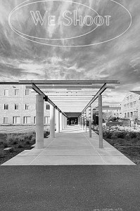
Color image    Black and white image

Today, very few people are using film to create their images, and commercial photographers were early adopters of digital photographic equipment.  I was one of the early ones.  So, I was faced with the question: How does one make a black and white image with a digital camera?  I can’t speak for all cameras, of course, as there are so many different ones.  Some cameras have a facility built in to take a b/w photograph.  We have an older point and shoot camera that doesn’t seem to have that capability.  It also shoots only jpegs.

Our DSLRs, or digital single lens reflex cameras, on the other hand, are able to shoot in a b/w mode.  Here are some caveats.  When shooting a jpeg image in b/w mode, the effect is permanent – I am unable to find a way to reverse the format once the image has been taken and it is black and white, should I desire the image in color.  We have Nikon DSLRs (this is our choice, and not an indictment of other brands), and they are also capable of shooting a “Raw Image.”  Raw is usually a non-destructive format, meaning that changes to the image can be deleted and the image returned to the state in which it was taken.  Raw is usually the choice of professionals, as there is more digital information left intact in the image, like color and density, than there is in a tiff or jpeg.  Raw images can be manipulated by computer software a lot more than the aforementioned tiff or jpeg, and a raw image can be converted to other formats after manipulation.  Here’s where there is an advantage to shooting raw:  even if the camera is in b/w mode, I can again get a color image from the raw format.  It seems the b/w mode is a filter in the camera, and if using the Nikon Capture NX2 software, it shows the image as a black and white, but the filter can be removed by the software.  Other software, like Photoshop CS4 doesn’t even see the black and white filter, and shows the raw image as one with the original color!  If taking a jpeg image with the same camera, the b/w effect is permanent!

We have a client, an advertising firm,  who wants all the image samples we show them and the images they order in black and white, gray-scale.  This is a lot of work, but it has its rewards.  We have gotten great expertise in doing this, and we have a lot of images that can later be used in color or black and white for other things, as well as stock.  These images are non-proprietary, meaning they aren’t of the client’s product, property, or personnel.  They are images from the world around us, and are used in an editorial way

So, what is our workflow for this client?  First, we shoot the images with a high-resolution digital camera, in color.  Then we process them in the Nikon raw editor, Capture NX2.  We tweak the color and density in this program and convert them to color tiffs.  Next, we open the tiffs in Photoshop CS4 where we further process them, removing flaws, lightening and darkening specific areas on the image.  Now, there are several ways to make a black and white image from color.  We prefer using the black and white adjustment layers in CS4.  It gives us a lot of ways to manipulate the image for contrast, density, and even filters the image like it was shot with a filter on the camera lens.  Want a dark or black sky with white clouds?  There are filters for that! (There’s an app for that!:-) ).  After getting what I want in the look of the image, I convert the image to a gray-scale tiff.  After I am done with the multitude of images I have created in this manner, I use Photoshop to batch the images to low-resolution jpegs, and put our copyright and/or logo on the sample images. This keeps unlicensed use from happening.

Next, I make a zip file out of all the sample images, and send them on to our client over the Internet, so they can choose which of the images they would like for their purposes.  Once they let me know what they want, I can either put them in a zip file and send it to them over the ‘net, or burn them to a DVD and send them via carrier.

That is just how we deal with one client.  Black and white photographs are abstract, different, and fun.  They are also a lot of satisfying work.

– Gary Silverstein

Tags: b/w, black and white, commercial, photographer, photography, professional
Posted in Tips | Comments Off on We Shoot Blog Kickoff – about black and white photographs

  • Categories

    • How To (20)
    • Information (546)
    • Learning (30)
    • Lighting (179)
    • Marketing (290)
    • Photographs, Images (543)
    • Tips (38)
    • Uncategorized (2)
    • video (13)
  • Archives

    • May 2025
    • April 2025
    • January 2025
    • December 2024
    • November 2024
    • September 2024
    • August 2024
    • July 2024
    • June 2024
    • May 2024
    • April 2024
    • March 2024
    • February 2024
    • December 2023
    • November 2023
    • October 2023
    • September 2023
    • August 2023
    • July 2023
    • May 2023
    • February 2023
    • January 2023
    • October 2022
    • September 2022
    • August 2022
    • July 2022
    • March 2022
    • February 2022
    • January 2022
    • December 2021
    • July 2021
    • June 2021
    • May 2021
    • April 2021
    • March 2021
    • February 2021
    • January 2021
    • December 2020
    • November 2020
    • October 2020
    • September 2020
    • August 2020
    • July 2020
    • June 2020
    • May 2020
    • April 2020
    • March 2020
    • February 2020
    • January 2020
    • December 2019
    • November 2019
    • October 2019
    • September 2019
    • August 2019
    • July 2019
    • June 2019
    • May 2019
    • April 2019
    • March 2019
    • February 2019
    • January 2019
    • December 2018
    • November 2018
    • October 2018
    • September 2018
    • August 2018
    • July 2018
    • June 2018
    • May 2018
    • April 2018
    • March 2018
    • February 2018
    • January 2018
    • December 2017
    • November 2017
    • October 2017
    • September 2017
    • August 2017
    • July 2017
    • June 2017
    • May 2017
    • April 2017
    • March 2017
    • February 2017
    • January 2017
    • December 2016
    • November 2016
    • October 2016
    • September 2016
    • August 2016
    • July 2016
    • June 2016
    • May 2016
    • April 2016
    • March 2016
    • February 2016
    • January 2016
    • December 2015
    • November 2015
    • October 2015
    • September 2015
    • August 2015
    • July 2015
    • June 2015
    • May 2015
    • July 2014
    • June 2014
    • May 2014
    • September 2013
    • June 2013
    • March 2013
    • February 2013
    • January 2013
    • December 2012
    • October 2012
    • July 2012
    • June 2012
    • May 2012
    • March 2012
    • February 2012
    • December 2011
    • September 2011
    • August 2011
    • July 2011
    • March 2011
    • December 2010
    • October 2010
    • September 2010
    • July 2010
    • June 2010
  • Meta

    • Log in
    • Entries RSS
    • Comments RSS
    • WordPress.org

Copyright © 2025 - weshoot.com | Entries (RSS) | Comments (RSS)

WordPress theme designed by web design