Weshoot.com

The Official We Shoot Blog

  • Home
  • About
  • To Comment

Posts Tagged ‘photography’

Video from still photography . . .

Sunday, December 11th, 2011

Slide shows have been around for a long time. How can someone use a still photograph in a video and see it move? One method in digital slide shows is to “pan” a still image – that is, pan across an enlarged still image by starting at one side of a room, for example, and move your “camera” to the other side of the room as though you were scanning the room with your eyes from one side to another. Another way is to see an element in a photo and to “back away” so as to see the whole image. There are many slide show programs out there which will do this. One thing lacking in these images is depth. If I took a still image of a staircase and “panned” it, it would lack depth. If I took a video camera and panned the same staircase, it would look more real because there would be a perceived foreground (the balusters or stair sticks) and background (back wall), actually appearing to have movement between the foreground and background due to “camera” movement.

A still photograph can’t have that movement – or can it? See the video above, and pay attention to the hamburger plate in relation to the background. This image was a still photo taken during a food shoot for a local restaurant chain, and reworked in both Photoshop CS5.1 Extended and Adobe After Effects CS5.5. As you can see, the meal gets bigger while the background stays the same size, blurs, and appears to move slightly to the right. The plate looks like it is coming toward you and away from the background. This gives the illusion of depth and movement. I have seen this technique in some old sepia photos from bygone eras on TV where a famous Wild West character comes out of an old photo toward you and the “camera” “moves” to the right. This adds a dynamic to a still photo making the subject three-dimensional, and gives the photo a video presence.

-Gary Silverstein
We Shoot

Tags: cheeseburger, commercial and advertising food photography, depth, food, food photography, food video, hamburger, movement, photography, realism, still image
Posted in How To, Tips | Comments Off on Video from still photography . . .

Food Photographers and Food Photography . . . Are you hungry?

Friday, August 19th, 2011

Food photography has been with us . . . well, since there was photography.  But then, there is FOOD PHOTOGRAPHY.  That “It looks so good, I can taste it!” photography.  That “It’s making me hungry photography!”  You know what I am talking about.  Prime examples are the Red Lobster video ads with butter dripping off seafood.  Don’t they make you hungry, even after you just ate?  Now, look at your food images.  Are they the victim of flat lighting  Do they lack color?  Do they make anyone hungry?

Almost everyone has a digital camera.  Some have better digital cameras than others.  Many have a small strobe built into the camera, while others may use a flash unit that fits in a shoe on the camera.  For a commercial pro, that would be the lighting of last resort just to document something.  This is the worst lighting one could use, especially for food.  Any small thing or element that is white or very light gets blown out and loses detail, like sour cream or whipped cream.  If the food image is mostly white or light colored, like vanilla ice cream, the strobe and camera may automatically adjust to make it gray, or a darker color, instead.  Did you ever wonder why the image you tried to take that reflected the flash back displayed as dark or a sickly shade of brown?  That is because the auto-exposure feature of the flash read only the brightest spot in the frame and shut down the strobe before it was able to light the darker areas.  Silverware, other bright metal, and glass have a habit of reflecting very bright hot spots with flat lighting.

Great food photography all has one thing in common: great lighting, which includes positioning the lighting to better enhance the food.  It is critical.  It all starts there.  See Example 1.

stir-fry

Example 1 - Click on image to enlarge.

See how the glistening highlights make this look juicy and delicious?  To make better-looking food images, the main lighting comes from the back, sides, or above to reflect on the food (in this case with a soft box).  Overall ceiling room lights don’t serve this purpose, nor does a flash mounted directly on a camera.  To see examples of what I see as overall room lighting or direct flash lighting for a similar food dish as Example 1, click here .  Of course, the services of a great food styl ist and a lot of post-production work is done in Photoshop to get the color and look found in Example 1.

It is said that a picture is worth a whole lot of words (1000, 10000, or the amount to be determined by the viewer) .  I say that a great food image is worth that many more sales.  If you are selling food, it pays to do a lot more work creating your food images, or you could hire We Shoot.  You can find us at weshoot.com.

– Gary Silverstein

Tags: food, food photographer, food photography, food stylist, http://weshoot.com, photographer, photography, we shoot
Posted in Learning, Tips | Comments Off on Food Photographers and Food Photography . . . Are you hungry?

“Photography is so easy . . . Why does a pro charge so much?”

Tuesday, December 14th, 2010

Note:  This article explains why pros like us charge what we charge and why we get it.


First, the long answer.

Photographers in the “ business” of photography don’t view their business as a hobby. The motivating factor is income. The average hobbyist – a nonprofessional – sees photography as an enjoyable pastime, and receiving money for their photography, although a nice addendum, is not the reason they engage in the activity. A hobbyist can be at several levels, from a novice to an accomplished photographer, but a pro has to always be at the top of his or her game to compete. After all, no professional photographer’s client wants to pay for sub-par images.

An amateur may show his shadow or reflection in the final picture, while a pro would never think of submitting such an image to the client. A nonprofessional photographer – an amateur – takes snapshots. “Click!” A pro may take a quick shot, but he or she quickly calculates variables to get the best possible shot, from the sun’s angle, to shadows, to exposure. To avoiding including as little as possible of his or her shadow so as to be less difficult to remove post-shoot. Getting closer to the ground or framing the subject through another object may not only get a more enticing image, it may as well eliminate the photographer’s shadow. Every little detail of an image is considered while shooting. Visualizing the image as a finished product, in two dimensions on a computer screen or in a print, is an essential part of the professional’s job.

Let me provide you with an example of work we do for a particular client to help illustrate the mark of – and the necessity for – a pro. This client, an out-of-state advertising agency, commissions our work for their client (a bank), sending us to many locations a year to shoot specific subjects (and other subjects we deem suitable) in the community around their branches. From our submission, our client chooses a number of images to be displayed in each branch for which we shoot. Requirements for these shoots include high-resolution images in a vertical, black and white, gray-scale format. If our images are submitted by FTP, they can be high-res jpegs; if delivered on DVD, they will be tiffs. No horizontal or color images (not even as sample images) will be accepted, so every sample image we send has been first converted to black and white. We have done a large number of jobs for this client because we deliver what they want, what they need. They expect artistry in taking the images and artistry in executing the post-shoot processing of each of our images.

Let me lead you through the workflow on the assignments we do for this agency. With the assignment comes a list of specific things in the community to shoot. We travel to the community, some as near to our studio as one hour, some as far as a day’s drive. We arrive in the community with maps we have printed up from our research of subject matter our client has shown primary interest in, and then we drive around to locate other targets we see as appropriate for this client. Leaving before sun break may be necessary for some objects of interest, knowing that a low-sun angle may cause our shadow to appear in the image, and conversely, if we are facing the sun, flares may occur (especially with a wide-angle lens), resulting in noisy silhouettes or blown-out skies. We are sometimes asked to shoot on a deadline in the rainy season, meaning diminished shooting days and hours. While shooting in the rain with its accompanied white or gray sky (cutting contrast, for just one example) can be dealt with, mist on the lens will ruin an image and must be carefully monitored. We also don’t typically shoot higher than 400 ISO, as this usually introduces an unacceptable amount of video noise to the discerning professional eye, especially in the shadow areas, but sometimes it must be done.

A discerning professional eye also abhors low-light conditions, so a portable flash mounted on a flash bracket is a necessary part of the equipment bag. One never knows when having a little more light could come in real handy.

You may ask what’s the big deal about shooting black and white. Simply set your camera to black and white, right? Well, after some experimentation, I found that our Nikon cameras’ black and white mode still shoots the raw images in color, and the camera is merely adding a black and white filter to the image. If I take the image in b&w mode, I can remove the b&w filter in Nikon’s raw editor, Capture NX2, or if I run it through Camera Raw in Photoshop CS5, it doesn’t see the filter that was put in by my camera, at all. So, I don’t even bother shooting it in b&w in the camera. I add it later as a layer in Photoshop CS5, which gives me more options in the look of the image.

So, let’s say that I take a close-to-perfect image. What happens then? The amateur can take the memory card to a camera-store kiosk to output to disk or print – enhanced to the kiosk program’s ability. Or, the amateur can elect to work on it himself, let’s say with Photoshop Elements, a relatively inexpensive program that produces good results. Great for the amateur photographer but a program which pales in comparison to the immeasurably more professional Photoshop CS5 and the raw editing of the aforementioned Nikon Capture NX2 – both incredible programs costing – and worth – much more.

Using the raw editor, I weed out the images that are not up to the caliber I wish to present to my client. Yes, even pros have camera movement, out-of-focus and under- or overexposed images. These are discarded. During the shoot, we take several images of the same thing, one of many differences between a pro and an amateur. This backup is further enhanced by using two different cameras and, when possible, two different shooters. One camera has the long zoom (18-200mm), and the other has an ultra-wide angle zoom (10-20mm) lens. If for some reason the subject isn’t captured successfully by one photographer, it is captured by the other. Consequently, we have several versions of the same subject from which to choose the very best for the client to select from.

All images that pass muster are then further evaluated with the raw editing program. Adjustment of density (lightness and darkness). Selection of the most accurate and impressive color. Saturation. And mild sharpening. The images are then converted to tif images, labeled with our copyright and other information from the image metadata.

Another place a professional such as myself is different than an amateur is hard-drive space. Hard-drive space is a commodity to me. I buy new one-terabyte drives to replace those that fill up. None of our professional images are erased to make room for new images. All work is stored on multiple drives. There’s never enough backup. Images are lost by the client – disks are misplaced – more times than I wish to count. It’d be death for my business if all I saved an image to was one drive and I got that fateful call from a client, and had a drive failure. In the long run in terms of both time and money, it is cheaper to save an image to the hard drive in perpetuity than it is to burn it to removable media (CDs and DVDs). This, of course, adds expense to the business. But it makes me more efficient. And takes up less room in my studio.

I now take the color tif images I made in Capture NX2 and bring them up in Bridge, the sorting program that comes with Photoshop CS5. Next, I open a number of them in Photoshop, magnifying each image to 100%. Having a powerful computer system with lots of processor horsepower and ram to run these programs is of immeasurable value, increasingly necessary to the professional with a large workload. I am currently running an i7-950 processor, and 12-gigs of ram with eSata internal drives and USB 3.0 external drives, a time saver for the loading and processing of the high-res images delivered by my cameras. Again, a necessary business expense. When efficiency and high quality are needed, sparing no expense is first on a professional’s business agenda.

At 100% magnification, I scrutinize each image for imperfections. A dust mote on the sensor can have the appearance of a fuzzy “ball” in the sky, and it needs to be touched out. If a distracting shadow or reflection was also captured in an image, that will need retouching work, as well. If a building’s sides aren’t straight (a distortion caused by the lenses and the angle taken), I will bend the image to make them so, if it enhances the look. Even if our client doesn’t demand it, cigarette butts and other things that distract from a good-looking image are removed to make it a better image. Providing a client with the best – from the image samples to the finished product – is a mark of a professional.

At this point, it is time to turn the image into a psd, or Photoshop, file. I then use a “black and white adjustment layer” in Photoshop to take away the color. Oftentimes, the b&w image will look “flat,” lacking contrast. There are several software filters available in Photoshop. Years ago, when using b&w film, a photographer might use a colored filter to enhance an image. A red filter, for example, will produce a dark or black sky with white clouds. Infrared film will produce white foliage. Photoshop has filters that mimic these traits in a b&w digital image, and can be modified as well. Or I may choose to add contrast or a light or dark sky, or make a “soft-light” layer and darken or lighten some section of the image only. The image is then saved as the layered psd file in case additional changes have to be made. At this point the image is still in color with adjustment layers. Once I am happy with the image, I “flatten” all the layers to one and save it as a gray-scale tif in another folder. When all of this is accomplished (my last job with this client totaled 107 and took several days), I prepare the images for my client. I use an “action” in Photoshop to automatically save a reduced-size version of each image in another folder as a low-resolution jpeg, and then I prepare another folder for additional backup. I then bring up every image in that folder in Photoshop, and use a brush “stamp” to put our “We Shoot” watermark on every one. But I am still not done. I then make a single “zip file” of all of these images to transfer to the client by FTP or into their drop box. I advise them, usually by email, that they’re ready to see, and they unzip the file with their unzip program to see all the images. I then await their notification of the image numbers they want in final high-resolution, sending them the images on disk, via FTP, or to their drop-box.

Why does a pro charge so much? When photography is so easy? Besides the photographic and post-production time and expense involved in making a successful image, it’s more than just love of the art. It’s knowing our work will make our client successful, increase their return-on-investment, and keep them coming back for more.

And the short answer is, being a professional – being able to provide high-quality photography to a client – costs money. We fulfill a need for a client who needs high-quality images, and we need to make enough to continue to provide high-quality business to our client. It makes our client money, and it makes us money. A successful image goes a long way in helping to sustain a successful business – a professional business – for our client and this pro. A win-win for all concerned.

-Gary Silverstein

raw image representation

Jpeg made from unedited raw image

color after editing

Jpeg of raw image after editing

black and white final image

Jpeg of final black and white image


Tags: black and white, color, commercial photographer, photographer, photography, professional, professional photographer
Posted in Learning | Comments Off on “Photography is so easy . . . Why does a pro charge so much?”

Shooting a new product . . .

Thursday, July 8th, 2010

Shooting a new product is something commercial product photographers face all the time.  Sometimes the client has ideas about how it’s supposed to look, sometimes not.  At times, it is easier to give the client the look he or she wants, if they spell it out, as opposed to “You’re the photographer.  You come up with a great image.  You’re the pro.  That’s what you’re being paid for.”  Or something to that effect.

The following product shoot fits the latter scenario more than the first:

I had three bottles of an inexpensive nail polish to shoot.  The bottles contained glitter.  I wanted to show the bottles to be more powerful than they are.  After all, from my perspective, if one is seeing the nail polish in an ad, it should appear to be, well, more than nail polish.  The bottles themselves were less than perfect.  In a big money promo shoot, a photo stylist will sift through many bottles to find the perfect ones.  Sometimes the manufacturer supplies the products, and sometimes the stylist has to go to several retail outlets to get the most perfect props for the image.  In the case of the nail polish, it was three colors of glitter nail polish – a red, an orange, and a green.  In this case, it was a low-budget shoot, meaning no stylist.  Also, I found only one local outlet for the product, and they had a limited supply.  So, I picked out the “best” bottles.

Next, I had to prepare them for the shoot.  Cleaning dust and fingerprints off needs to be done.  It is harder to remove these blemishes with editing software than cleaning the bottles physically.  I used an anti-static cloth, and a can of Blow-Off to remove the aforesaid marks and dust.

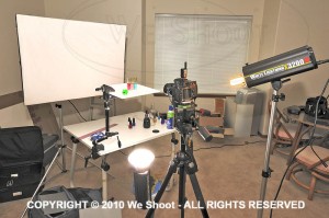
I placed them on a translucent white square mounted over a studio strobe.  This lights them from underneath and eliminates shadows.  It also provides white light behind the clear parts of the glass.  See setup image below, example 1.

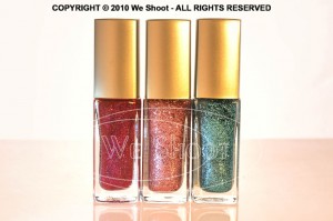
After adjusting three studio strobes and the camera for the exposures I wanted, I then captured the image you see in example 2. As you can see, the color is way off due to the lighting changes, so color correction was in order.

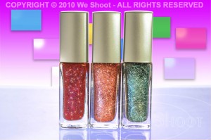
With numerous changes made in Photoshop, including adding more glitter than I could get from lighting alone, I created the image in example 3.  Glitter comes from adding a small light source to shine on the glitter.  I used a bare bulb on one strobe and shut off the strobe part so the modeling light would act as a small light source (hence the yellowness in example 2).  I increased the time exposure to allow that bulb to put enough light on the subject to appear bright against the instantaneous strobe light.  I also used a “mine flashlight” (the green object to the left front of the nail polish bottles in example 1) to shine on the bottles.  I additionally added small specs of glitter to the bottles with a “bling brush” in Photoshop in several colors.  I had to add the colors and rectangles and shadowing to the background.

What if I told you that given the “You’re the photographer . . .” speech above that once the image was shot, there were several tries with internet communication about colors and backgrounds before the client was happy.  Like I said, it is sometimes easier to make the client happy when they have a clear image of what they want, and they convey that idea to the photographer.  Otherwise, it is a real challenge to guess what the client will like, and it may take several tries.

In the end, it is nice to see the finished product.  But very few know how much work and dedication go into that finished product.  Now you have an idea.

-Gary Silverstein

Example 1 - Click on image to enlarge.

Example 2 - Click on image to enlarge.

Example 3 - Click on image to enlarge.

Tags: advertising, glitter, Marketing, nail polish, photograph, photographer, photography, promo, promotional
Posted in Learning | Comments Off on Shooting a new product . . .

Losing track of why we market!

Monday, July 5th, 2010

My partner and I frequently hear, “Professional photography is not in the budget.”  Or, “We have no budget for photography in our marketing.”  But the issue that keeps cropping up for me is that I think these companies lose sight of what is really important.

First, if a company is marketing itself, how many of them think that prospective clients really have time to read a lot of text about their company?  Since most marketers know that time is of the essence, photographs say a lot more than words do in a short period of time.  If the company markets itself with substandard images, e.g. underexposed, blurry, or just plain amateurish shots, what does the prospective client think?  The client subconsciously thinks that what this company does is shoddy work and it is mirrored in the substandard images!  The real problem is that the selling company sees gre at photography in the light of what it costs as an expense instead of what it costs for the bottom line.  Why do you think Target spends so much money and time on those TV ads?  Great photography translates to a fatter bottom line for Target.

The other day, I received a brochure in the mail from a local hospital.  It had a number of what I would say are stock shots:  happy, smiling people dealing with the hospital as patients or employees.  To the untrained eye, this was acceptable.  However, the only image of the hospital exterior itself was taken by someone who could best be described as a novice amateur.  While the image appeared sharp, it appeared severely underexposed under the awning in the area of the front door.  It looked for all the world like someone ran outside with their point-and-shoot camera and got an image to be used in the brochure.  It was free, a no-cost shot.  But, was it really?  The people who took this shot were either unwilling or unable to get something better.  As a pro, I would have taken several exposures of the entrance, at different exposure settings.  This would have allowed me to cut the contrast and make the entranceway almost as light as the building by combining the shots to make a good one, either by HDR or masking techniques.  The resultant image would have made the doorway a much more inviting look.  Do you want to walk into a doorway in darkness?  Hospitals are scary enough, without making the image appear foreboding.  How many patients won’t contact this hospital, just because this image puts them off psychologically?  If they lose just one, it will cost them more than hiring a good pro photographer, considering what healthcare costs these days.  And I’ll wager they’ ve lost more than one client.

So, the end result is that while the hospital saved on not hiring a pro photographer, it cost them much more out of their bottom line.  All because they forgot one thing.  Good marketing isn’t about how much you spend on it, it’s about how much you get back from its execution.

If you are going to spend money on any marketing pieces, make it count.  Go for the best paper, printing, graphics, and text.  But above all, don’t stint on the photography.  It can make or break the rest of what you are trying to do.

-Gary Silverstein

Tags: advertise, advertisement, advertising, business, Marketing, photographer, photography, professional
Posted in Marketing | Comments Off on Losing track of why we market!

Reflecting on Reflections, Part 2

Thursday, June 24th, 2010

Without a doubt, the hardest single thing I ever photographed was, of all things, something so ubiquitous that we handle them every day.  I am talking about door knobs.  Plain, highly reflective, brass doorknobs.  Now, why is it so hard to photograph a doorknob?  Well, it becomes a lot more difficult when there are some rules.  Rules like one would run into with a doorknob manufacturer looking for someone to shoot images of their products for promotions.  Do you think they want a reflected image of a happy, smiling distorted photographer looking out from their new brochure at the viewer?  How about seeing that photographer’s camera and tripod, or the space the doorknob happens to be in?  Simple, inexpensive, plain, highly polished brass doorknobs become painful to contemplate as a product photographer.  They not only are spherical and reflect the entire world around them, they have a backing plate made of the same stuff, that will reflect things that exist behind the knob, from the reflection on the back of the knob.  

Several years ago, we had spoken with a potential client, the marketing department head at a large manufacturer of doorknobs, hardware, and faucets about working for her company.  She said she had several photographers she used for shooting these products, but she said she would send us a sample of their products so that we could submit a test photograph to show that we could handle this type of photography, in case she needed our services.  Parameters for shooting this product were clear.  Shoot it on a 4″X 5″ transparency, and no retouching of any kind was permitted.  She said they did any retouching needed at the graphics department at the manufacturer.  

About 5 days later, the product arrived by UPS.  There was a plain brown cardboard box inside the outer package.  I opened it up and beheld a photographic nightmare.  It was an inexpensive, highly-polished brass doorknob set, complete with keys.  

It reflected everything!  It saw me, the room, everything in the room, and to my horror, the backing plate re-reflected everything the back of the knob “saw.”  I knew this was to be a fight.  I looked at images of doorknobs in advertising.  They looked perfect.  Some were “brushed” metal – not polished, but still shiny.  Some were dull finished, and just reflected highlights.  The polished ones stood out.  No reflections of photographers, cameras, tripods, rooms, etc.  I assumed that there was some reflection of a camera lens somewhere during the taking of the image, as there was no way to avoid the reflection from the angle presented.  A different angle may have allowed one to position the lens where the reflection would be positioned over the keyhole, but you can’t shoot there for different angles.  The first problem includes camera, tripod and photographer reflections.  One way to avoid this taking up a lot of room on the doorknob is to make a blind out of white material, like foam core, and cut a hole through which the camera lens “sees” the doorknob.  

Although this cuts down on untoward reflections, it still reflects the lens and the hole, unless the hole is dark and tight around the lens.  I figured this made for a minimum of retouching at the graphics department, and would be acceptable.  A second consideration was the lighting.  Lights or hot spots show up on the product itself and a smooth highlight with no hot spots would be a better solution.  Everything I tried did not work!  As said before, putting a piece of foam core in front of the doorknob cut down reflections, but I thought that aiming lights from behind the doorknob and bouncing the light toward the white foam core blind would produce the effect without bad reflections.  I was wrong.  The strobe “soft boxes” reflected into the back side of the door knob and re-reflected off the backing plate.  I had distorted oblong light reflections staring at me from the backing plate.  

It became evident there must be a way to do this.  I tried white sheets, but the lights created hot spots, and it reflected any corners and folds.  I had seen a shooting tent at my local pro camera store, and headed down there next.  A tent like this was used to evenly light small products and I thought this was the ticket.  It cost $250.00 plus tax.  I got the tent home, and assembled it.  It was made of a translucent white fabric, meant to diffuse the light inside.  It also was rigid and had seams and a rigid frame inside the fabric which showed up in the reflections.  It had several holes for camera placement, and try as I might with stuff to cover them, they showed up, too.  Fortunately, I was able to return the tent for a refund as it really didn’t do the job.  

I even talked to man who owned a company that made plastic blister packs in Santa Barbara.  I drove out to Santa Barbara to get a prototype dome of a transparent, but clouded plastic that he was thinking of producing.  It took out most of the distracting reflections, but reflected the cloudy nature of the dome and made the doorknob appear dull and not highly reflective.  I sent it back to Santa Barbara with a thank you note and a description of the effect.  

I finally built a box enclosure of translucent white plastic, got what I thought was a good image and sent that to the marketing manager.  She said to keep the doorknob, and she would call us if she needed us.  Last I heard, she was working for another company doing something completely different.  She never called!   

Below is the image I created, after scanning it and retouching it for our portfolio.  Shiny, reflective doorknobs are tough.  Try it if you doubt me.  

– Gary Silverstein      

Doorknob with minimal reflections - click on image to enlarge

Tags: 4x5, camera, photography, Photoshop, reflecting, reflections, retouch, shoot, shooting, view, view camera
Posted in Learning | 10 Comments »

Website Photography – Shoes of the Trade

Monday, June 21st, 2010

In regard to business marketing, I hear a lot lately about the importance of social networking via LinkedIn, Facebook, and Twitter.  These now accepted “Tools of the Trade” are geared to procure business and, if done right, are utilized to connect your prospective clientele to your website.  Your connections, “friends,” and fellow “tweeters” come to your website to read more about your business’s product and service.  That’s the idea, right?  So, now they’re there, and what do they see?  A great website with Flash, wonderful text, and “visuals.”  But one thing in too many cases is sorely missing.  Effective visuals.  Positively impactful, impressive, and just good old-fashioned aesthetically pleasing photographic visuals.

I hear this sad refrain from almost every website designer with whom I speak.  “My new client already has pictures, and no matter how much I say I want new photography, they say ‘these are good enough.’ “ And, yes, the vast majority of website designers I speak with say, “no, they aren’t good enough.”  “Not only,” they complain, “are they not good enough for their lack of professionalism, they are low in resolution, and, more often than not, they are a complete contrast to the professional, artistic, and beautiful website I want to create for them.”

So, what’s a professional, artistic web designer to do?  Less stellar work so as not to contrast with the horrible pictures?  More beating of their heads against the wall?  Resorting to other self-destructive activities

Tell you what, instead of contributing to the demise of artistry in web design, let’s give your web designer a break.  Just like website designers, I expect you want photographic images at your site that reflect the work you do in the most positive and attractive way possible.  After all, having a website is an essential tool of the marketplace.  It’s your online brochure.  And like your brochure, showing your product in its best light necessitates putting your best foot forward.

You know the importance of keeping your shoes polished in business, right?  A good haircut, attractive clothes, well-manicured hands?  I mean, you never know when you’ll encounter a potential client.  You never know when a potential client is looking at your website either.  Shine those shoes.  Polish those pictures.  Show your product off attractively.  Give everyone who goes to your website the impression that their opinion is valued.  Because it is.  If the impression created by your website is that your product lacks value, they won’t value your business, and since this is all about social networking, guess what impression will be emailed and tweeted to your “friends” and “connections” . . . and, directly or indirectly, to your prospective clientele? 

If through LinkedIn, Facebook, Twitter, or whatever means of social networking you employ you invite people to a website utilizing photography that is unpolished, unattractive, and unprofessional, your business, too, will be interpreted as unpolished, unattractive, and unprofessional.  Your website – just like your polished shoes – is one of the most important Tools of the Trade.  Make sure you put your best foot forward with a website with polish . . . photography that shines.

 – Dione Benson

Tags: art, facebook, linkedin, Marketing, photography, shoes, social networking, tools, twitter, website, website designers
Posted in Marketing | Comments Off on Website Photography – Shoes of the Trade

We Shoot Blog Kickoff – about black and white photographs

Monday, June 14th, 2010

Color image    Black and white image

Today, very few people are using film to create their images, and commercial photographers were early adopters of digital photographic equipment.  I was one of the early ones.  So, I was faced with the question: How does one make a black and white image with a digital camera?  I can’t speak for all cameras, of course, as there are so many different ones.  Some cameras have a facility built in to take a b/w photograph.  We have an older point and shoot camera that doesn’t seem to have that capability.  It also shoots only jpegs.

Our DSLRs, or digital single lens reflex cameras, on the other hand, are able to shoot in a b/w mode.  Here are some caveats.  When shooting a jpeg image in b/w mode, the effect is permanent – I am unable to find a way to reverse the format once the image has been taken and it is black and white, should I desire the image in color.  We have Nikon DSLRs (this is our choice, and not an indictment of other brands), and they are also capable of shooting a “Raw Image.”  Raw is usually a non-destructive format, meaning that changes to the image can be deleted and the image returned to the state in which it was taken.  Raw is usually the choice of professionals, as there is more digital information left intact in the image, like color and density, than there is in a tiff or jpeg.  Raw images can be manipulated by computer software a lot more than the aforementioned tiff or jpeg, and a raw image can be converted to other formats after manipulation.  Here’s where there is an advantage to shooting raw:  even if the camera is in b/w mode, I can again get a color image from the raw format.  It seems the b/w mode is a filter in the camera, and if using the Nikon Capture NX2 software, it shows the image as a black and white, but the filter can be removed by the software.  Other software, like Photoshop CS4 doesn’t even see the black and white filter, and shows the raw image as one with the original color!  If taking a jpeg image with the same camera, the b/w effect is permanent!

We have a client, an advertising firm,  who wants all the image samples we show them and the images they order in black and white, gray-scale.  This is a lot of work, but it has its rewards.  We have gotten great expertise in doing this, and we have a lot of images that can later be used in color or black and white for other things, as well as stock.  These images are non-proprietary, meaning they aren’t of the client’s product, property, or personnel.  They are images from the world around us, and are used in an editorial way

So, what is our workflow for this client?  First, we shoot the images with a high-resolution digital camera, in color.  Then we process them in the Nikon raw editor, Capture NX2.  We tweak the color and density in this program and convert them to color tiffs.  Next, we open the tiffs in Photoshop CS4 where we further process them, removing flaws, lightening and darkening specific areas on the image.  Now, there are several ways to make a black and white image from color.  We prefer using the black and white adjustment layers in CS4.  It gives us a lot of ways to manipulate the image for contrast, density, and even filters the image like it was shot with a filter on the camera lens.  Want a dark or black sky with white clouds?  There are filters for that! (There’s an app for that!:-) ).  After getting what I want in the look of the image, I convert the image to a gray-scale tiff.  After I am done with the multitude of images I have created in this manner, I use Photoshop to batch the images to low-resolution jpegs, and put our copyright and/or logo on the sample images. This keeps unlicensed use from happening.

Next, I make a zip file out of all the sample images, and send them on to our client over the Internet, so they can choose which of the images they would like for their purposes.  Once they let me know what they want, I can either put them in a zip file and send it to them over the ‘net, or burn them to a DVD and send them via carrier.

That is just how we deal with one client.  Black and white photographs are abstract, different, and fun.  They are also a lot of satisfying work.

– Gary Silverstein

Tags: b/w, black and white, commercial, photographer, photography, professional
Posted in Tips | Comments Off on We Shoot Blog Kickoff – about black and white photographs

Next >>

  • Categories

    • How To (21)
    • Information (548)
    • Learning (30)
    • Lighting (179)
    • Marketing (291)
    • Photographs, Images (545)
    • Tips (38)
    • Uncategorized (2)
    • video (13)
  • Archives

    • September 2025
    • June 2025
    • May 2025
    • April 2025
    • January 2025
    • December 2024
    • November 2024
    • September 2024
    • August 2024
    • July 2024
    • June 2024
    • May 2024
    • April 2024
    • March 2024
    • February 2024
    • December 2023
    • November 2023
    • October 2023
    • September 2023
    • August 2023
    • July 2023
    • May 2023
    • February 2023
    • January 2023
    • October 2022
    • September 2022
    • August 2022
    • July 2022
    • March 2022
    • February 2022
    • January 2022
    • December 2021
    • July 2021
    • June 2021
    • May 2021
    • April 2021
    • March 2021
    • February 2021
    • January 2021
    • December 2020
    • November 2020
    • October 2020
    • September 2020
    • August 2020
    • July 2020
    • June 2020
    • May 2020
    • April 2020
    • March 2020
    • February 2020
    • January 2020
    • December 2019
    • November 2019
    • October 2019
    • September 2019
    • August 2019
    • July 2019
    • June 2019
    • May 2019
    • April 2019
    • March 2019
    • February 2019
    • January 2019
    • December 2018
    • November 2018
    • October 2018
    • September 2018
    • August 2018
    • July 2018
    • June 2018
    • May 2018
    • April 2018
    • March 2018
    • February 2018
    • January 2018
    • December 2017
    • November 2017
    • October 2017
    • September 2017
    • August 2017
    • July 2017
    • June 2017
    • May 2017
    • April 2017
    • March 2017
    • February 2017
    • January 2017
    • December 2016
    • November 2016
    • October 2016
    • September 2016
    • August 2016
    • July 2016
    • June 2016
    • May 2016
    • April 2016
    • March 2016
    • February 2016
    • January 2016
    • December 2015
    • November 2015
    • October 2015
    • September 2015
    • August 2015
    • July 2015
    • June 2015
    • May 2015
    • July 2014
    • June 2014
    • May 2014
    • September 2013
    • June 2013
    • March 2013
    • February 2013
    • January 2013
    • December 2012
    • October 2012
    • July 2012
    • June 2012
    • May 2012
    • March 2012
    • February 2012
    • December 2011
    • September 2011
    • August 2011
    • July 2011
    • March 2011
    • December 2010
    • October 2010
    • September 2010
    • July 2010
    • June 2010
  • Meta

    • Log in
    • Entries RSS
    • Comments RSS
    • WordPress.org

Copyright © 2025 - weshoot.com | Entries (RSS) | Comments (RSS)

WordPress theme designed by web design